


Casino Uplift
A project I initiated.
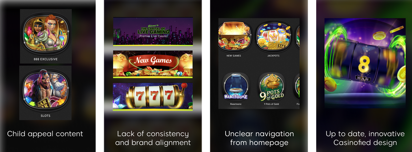
888's casino was profitable but outdated in design. With minimal cost, I revamped the site's appearance dramatically.
I presented to all stakeholders and successfully convinced them of the necessity for this change. Following its success, we adopted this approach across all our brands.
Why&How
Why do we need it:
How we going to do it

Arenas and
images atmosphere
Shape, Colors, Composition and Concept
Say goodbye to the tv frame, Hello modern shape

Instead of to many colors - specific brand colors

One simple composition for all arenas

Why these colors?
These color palette already exist in the product, and many more colors...
We need to be consistent with these colors.

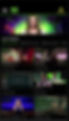
The New arenas

New vs old

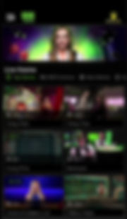
User Testing
we wanted to check that users did understand the arena usability.
Task: You are on the home page, go to the live casino page.


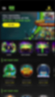

Arena made of:


Color dosages

Images atmosphere
are images in the header of web pages, serving as visual cues for users to understand their location within the site. They enhance the site's identity and reinforce its brand presence.

New vs old


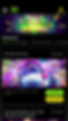
Atmosphere images brought to life with Lottie!
Replacing our static images with gentle loop animation images

Background color
Remove Texture, change color + add gradient
Old vs new

The Light Gradient in the bottom helps the game icon stand out.

Without gradient

With gradient
UI Scrolling
Color + Background blur + Font alignment
Instead of scrolling with solid color that overloads the screen, we use transparent scrolling with a blurred background that gives a more open feeling on the screen.

Old Scrolling
New Scrolling
UI Touch ups
Icons alignment, User area icon, up-to-date user interface
Aligned icons


-
Different colors
-
Active mode
-
Sizes
-
There is no title to the live casino page
-
Smaller icons
-
Active mode unified.
-
Text on the side - With text on the side we have more property for the games - we save 7.5% space from the size of the screen

User Testing
We want to check that users understand that these tabs are filters and that they know how to use it.
Task: Find a blackjack game on the live casino page


New icon
Old icon
New user area icon

-
Generic
-
Male - gender
-
Made from the 888 logo.
strengthens the brand.
Unisex
Main Banner Layout + Assets alignment
Instead of being in a frame, the banner spreads over the entire width of the page, This makes the arena buttons look bolder and clickable. In order to create a sense of open space.

Old Banner
New Banner
A total of 7% more real estate

Face to Face
Full screens before and after
Users reaction to the new HP

Home page

Old HP
New HP
Slot

Live

Promotions

HP Desktop

Promotions Desktop